Reimagining color theming for Condé Nast Design System
- Irfan Rafeek
- Jul 4
- 7 min read

Updated: Sep 15
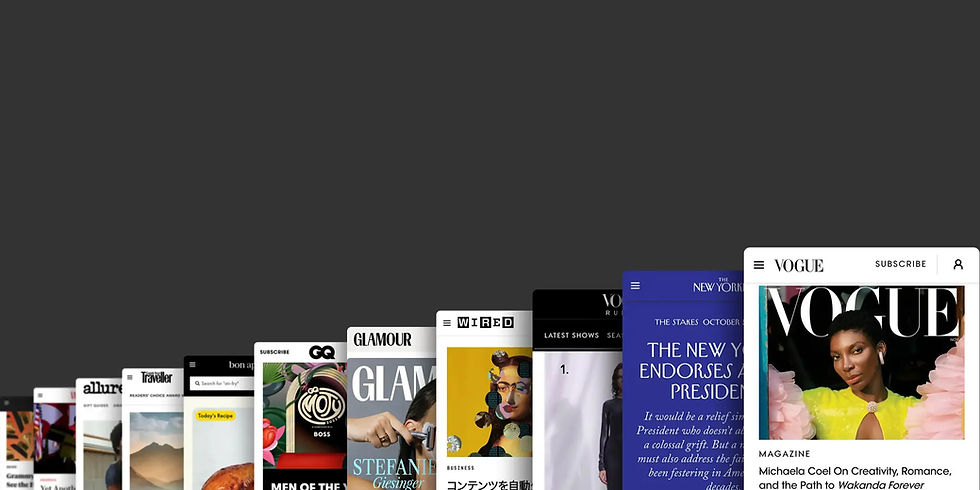
Condé Nast is home to a diverse portfolio of iconic global brands — including The New Yorker, Vogue, GQ, Bon Appétit, Condé Nast Traveler, Wired, and Vanity Fair — each with its own distinctive visual identity and editorial voice. The digital experiences we create must honor and amplify the uniqueness of each brand.
At the foundation of all these experiences is Verso, Condé Nast’s unified, token-based design system. Verso powers every brand interface with the flexibility to support highly personalized and often complex brand expressions at scale.
The Existing Workflow
Each Condé Nast brand has a unique Brand Identity (BI) file that defines its visual language. These BI files exist in both Figma and production as JSON. Designers start by building screens using the default component which uses "brandless" theme. Then use our in-house Figma plugin to instantly apply any brand’s visual style by swapping in the corresponding BI token set.
To update the visual identity, designers edit the Figma BI file, export the tokens via plugin, and hand off the generated JSON to engineers for implementation.
The Problem
Verso is currently more than 5 years old. Over time, as we supported increasingly personalised brand needs, Verso grew significantly and with that, so did the complexity as well. Supporting unique brand expressions led to a rapid and unsustainable growth in token count.
Whenever existing tokens didn’t fully support a specific design need, the go-to solution became creating new ones. For example, if a brand wanted a distinct accent color for a “story collection” module, a new set of tokens would be added. Similar duplications happened across sections like navigation, story cards, and page modules — resulting in multiple overlapping token groups within the same BI file.
To make things worse, brands often started mixing tokens across groups, combining background tokens from one set with foreground tokens from another. This led to semantic inconsistencies, accessibility risks, and growing confusion among designers, especially when working on new components or layouts.

Over time, a single BI file expanded to more than 200 color tokens, making it increasingly difficult to maintain and scale. Many brands didn’t even require such a large set, yet they were still forced to manage the entire collection.
In cases where new pages needed a completely different theme, such as events, sub-brands, or seasonal campaigns — teams would spin up entirely new BI files, effectively doubling the token count. For example, there are currently 10 separate BI files just for The New Yorker, each created to address different visual needs and only less 10% of the tokens were used in each theme.
Beyond theming, other challenges emerged:
Overly complex naming — Tokens like discovery.body.white.accreditation were difficult to interpret and apply correctly.

Engineer dependency — Token updates required manual involvement from developers, slowing down iteration and increasing the cost of change.

Current theming workflow
The Opportunity: Reimagining Theming
We held multiple workshops with brand teams to explore how they wanted to evolve their designs. We saw a wide range of ideas which was heavily bulit on wide range of color usages. Color played a central role in storytelling. But our system needed a better structure to support these evolving needs.
Our design goals:
Support theming at multiple levels starting from component to layout to page.
Simplify theming for designers
Improve maintainability for design and engineering
Support flexible brand expressions without bloating token files
Preserve accessibility
We explored multiple concepts, eventually narrowing down to the model named on core pricipal One Surface, One Theme
A theme is centered on a single surface (background)
All associated foreground tokens are designed to work in harmony with that background
Every scalable component should by default use the theme background color
Exceptions allowed only for smaller interaction components like buttons or action bars
Team
This work was made possible through the efforts of a truly global team, with members based across the UK, US, and India. Our core group included three designers, a product manager, two developers, and a content designer — each bringing unique expertise to the table. Strong cross-functional collaboration was at the heart of our process, enabling us to move quickly, solve complex challenges, and ensure the solution worked seamlessly across both design and engineering workflows.

The New Model
The newly designed BI file can support multiple themes. Designers can now create any new themes within the same BI file and use it flexibly across any components, layouts or pages.
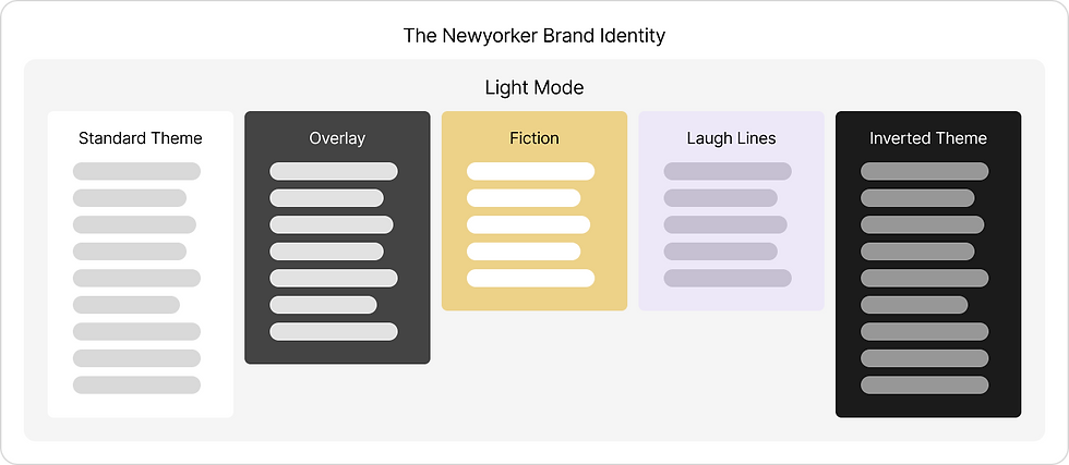
Under the new system, every brand will have only one Brand Identity file. A BI file is a collection of design decisions used to style components for our iconic brands. Themes are be defined under modes. A mode is collection of design decisions to help users control their experience based on their needs, environment, or visual preferences. For ex: light mode/dark mode.
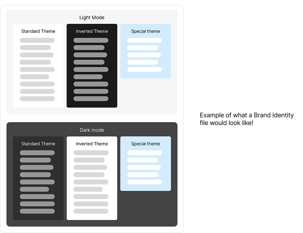
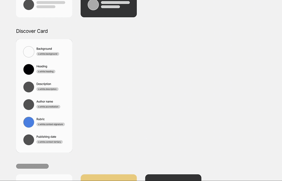
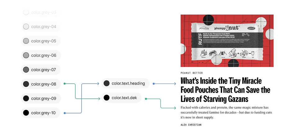
Theme: A collection of design decisions that express a brand’s color preferences, special content, sub-brands, and brand events. Under the new model a theme is defined by a single background (surface) color and set of on-surface tokens that visually pair with that background.
All brands will have two token sets:
Primitive color tokens: A set of all foundation colors used by a brand, stored as HEX or RGB. These shouldn’t be used directly — instead, primitive tokens are referenced by semantic tokens. While there are no strict rules for naming, we recommend following a color ramp for predictability and to help designers choose tokens more easily.
Semantic color tokens: Contextualised, purpose-driven aliases for primitive tokens. They provide meaning and intent for how design values should be used in the user interface.
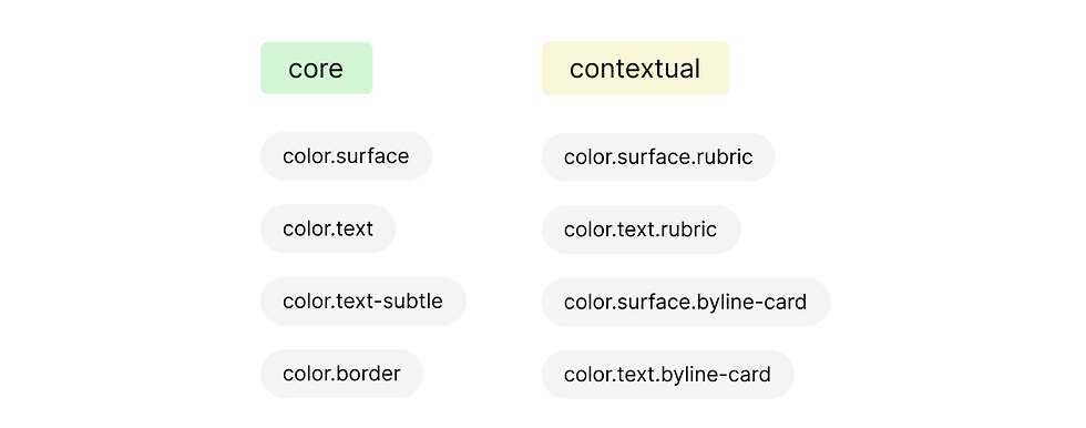
The Semantic color tokens are further categorised into two groups
Core Tokens: General-purpose tokens shared across instances. Includes all color tokens for generic use case, utility, interactions and feedbacks.
Contextual Tokens: Specific tokens tailored to specific use cases
How it works
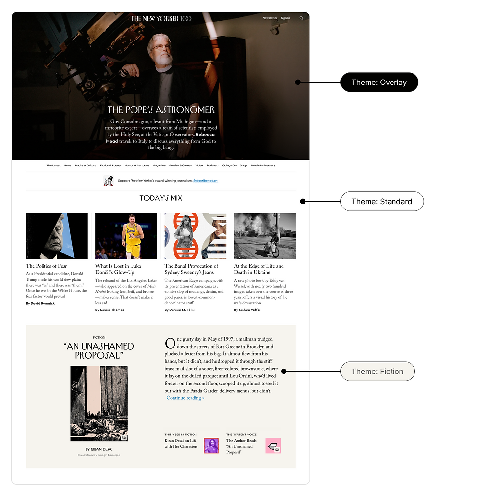
The new approach allows us to have a page level and component specific themes.
Page level theme - a theme that applies to an entire page. The page level theme should be the most prominent or dominant theme on a page. Component specific theme - a theme that is applied to a specific component on a page and is different from the page-level theme.
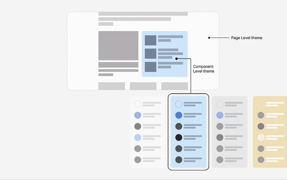
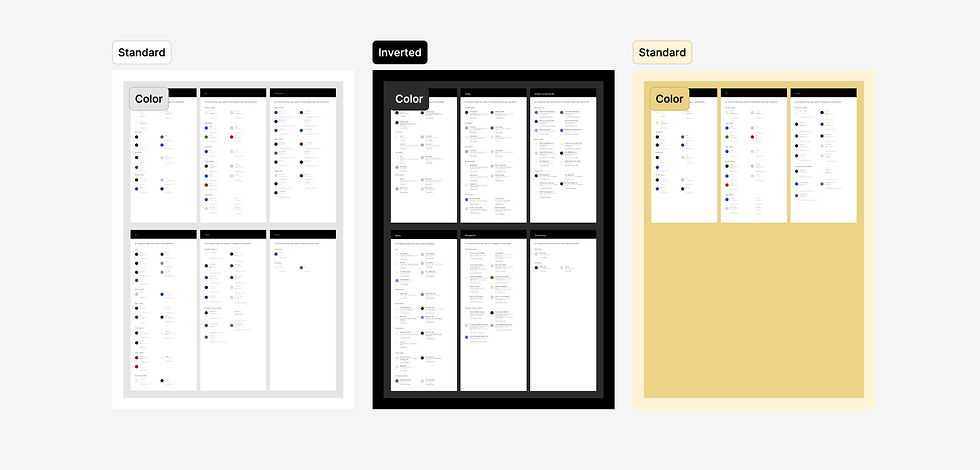
All brand identities share a Standard Theme that defines the complete token set, ensuring consistency across the Condé Nast ecosystem. The real advantage of the new system comes into play when a brand wants to theme a specific instance. Previously, theming was restricted to a fixed set of tokens, bringing many limitations.
In the new approach, brands only need to define the tokens relevant to their use case, no more copying the full set for smaller theming needs. This makes the system highly flexible, lightweight, and far easier to manage.
For example: If The New Yorker wants to introduce a special theme for the The NewYorker Fiction section, they can now create a lightweight called “Fiction” that only defines a background color and need foreground tokens for navigation For the Fiction section.
Now with the new Fiction theme, it can be pulled to any component in the New Yorker Brand Website. The rest of the design continues to fall back on the Standard Theme. Instead of duplicating hundreds of tokens, the brand adds just a handful, keeping the system flexible, scalable, and easy to maintain.
The New Design Process
In the new system, theme creation and management is completely controlled in Figma. We created a new structure to define the whole new tokens within a frame. When a brand wants to introduce a new theme, they simply duplicate the frame and include only the tokens they need for the theme. This lightweight approach avoids unnecessary duplication and keeps BI files focused and manageable.
Once the library is published, the update automatically flows into Verso Settings - our internal application. Here, designers and product managers can preview the new theme, apply it at different levels (brand-wide, page-specific, or even at the component level), and make overrides where needed.

Verso Settings also provides options to review and publish changes, giving stakeholders visibility and control without requiring engineering support. As a result, the entire lifecycle of managing and updating tokens and themes - from definition in Figma to live deployment - can now be handled by designers and product managers with near-zero engineering involvement.
The new token naming structure
The new token naming was designed by sticking to these principles-
Clarity: Simple, clear, and human-readable names.
Consistency: The same structure and language throughout.
Confidence: Minimize onboarding and cognitive load.
Flexibility: Adaptable to each brand’s unique needs.
The primitive tokens will follow structure color.name. Where the brand would choose the name based on how they conceive primitives. Ex.color.c1, color.grey-02. Semantic tokens are grouped into two Core tokens and Contextual tokens.
Both types of semantic tokens follow the same naming strategy of broad -> specific.
The name is grouped into 4 parts. Foundation, Object, Context and Modifier.

Foundation defines the type of token. Currently Verso supports Color, Type, Spacing, Motion, Decoration
Object: Defines the element that the design decision applies to color token objects: Text, Surface, Icon, Border
Context: Defines contextual token names by identifying the category or component where the object is applied. There are many possibilities for Context words. They may be specific to a component or a group of components. Some possible context words: Rubric, Card, List, Title, Button, Status, Chip
Modifier: Defines the attribute of the Object or Context. It identifies how the Object or Context has changed from the default. While there are many possible words for modifiers, they should be limited to relationships, scales, states, and component variations. Some possible modifier words: subtle, strong, hard, lg, md, sm, 1x, 2x, hover, disabled, active…
What we achieved
This new model has led to several key improvements:
A new BI file that support theming at multiple levels starting from component to layout to page preserving accessibility
Significantly reduced the number of tokens by eliminating duplication
Cut down engineering effort to nearly zero. Designers can now create or test new color expressions without engineering support.
Brought clarity to token structure and naming, with 85% of tokens correctly mapped by designers during testing
Strengthened accessibility by keeping surface–foreground pairings tightly scoped and intentional
More importantly, it empowers our brands to experiment and evolve their visual identity, without compromising system integrity.
Comments