Ahead
- Irfan Rafeek
- Dec 2, 2020
- 7 min read

Updated: Oct 27

Ahead
Ahead is a web app by Quintype that helps publishers create personalized and branded websites, both in terms of visual design and basic functionality.
Quintype
Quintype provides a complete suite of digital publishing solutions that are powerful, easy to use, and dependable. The backbone of these solutions is a content management system, a great product called Bold that supports all running verticals. Bold is an intuitive publishing platform designed for new media organizations to create, curate, and publish content across devices and channels.
With Quintype, publishers can also design engaging brand experiences that reflect their identity and audience needs. Exercises involve running design sprints by collaborating with publishers to understand their problems and to find suitable solutions.
Few of the clients include Bloomberg Quint, Fortune India, National Herald, Prabhath Khabar, Afaqs, Mediaone.
Problems
Publishers came from diverse verticals and produced different types of content, each demanding its own visual style and user experience.
For medium and large publishers, launching a new website often took months, and even minor updates required heavy investment.
To help publishers go live quickly, we offered a generic theme. But it fell short. It couldn’t adapt to varied content types or reflect each publisher’s unique brand identity. As a result, many smaller publishers struggled to create a distinct visual presence online.
The Solution
To solve this, we created Ahead, a tool that allowed publishers to build tailored websites at scale without starting from scratch each time. Ahead was based on a component-driven system inspired by atomic design principles

The Process
We had the data - Inferences based on previous design sprints, inputs from meetings with publishers and their audience. We took what we had and listed it down:
Requirements

We had already been practicing a structured approach in our design workshops with publishing clients. Each workshop began with a well-defined component library, a set of UI elements versatile enough to address a wide range of publishing needs.
By the end of these sessions, we typically arrived at a clear wireframe outlining the end-to-end user experience for that specific publisher. The next step was to layer their brand identity on top of this structure.
It struck us that this exact approach could scale beautifully. Instead of starting from scratch for every client, we could create a design system with a set of brand-agnostic components, designed specifically for publishing verticals. Publishers could then build their own brand experiences using these components, while we provided the flexibility to customize and style them to match their identity.
Our goal was to develop a product capable of generating any publishing website — driven by business requirements, assembled from reusable components, and easily tailored to reflect each publisher’s unique brand.
Building a unique brand experience for Publishers
We understood that brand identity is not confined to brand colors or logos. We broke down the concept of brand identity into visual elements that served as building blocks for a publisher websites - these elements helped aid brand recall.
Building Blocks ( Atoms )
Building blocks on a landing page include section tag, collection title, button, author name, publishing date, article title, etc. These basic blocks are called atoms. Atoms are unbreakable and are consistent across the website.

Possible Story Cards from Atoms (Molecules)
Atoms, when put together, form molecules. A typical example is story cards. Multiple atomic combinations can be used to form a story card. Based on the chosen atoms, molecule designs vary for different publishers.

Row
Molecules, when put together, form a Row. For example, story cards combine to form a row. With different combinations of atoms and molecules, the same row design can be made visually unique for individual websites.

Key things that we kept in mind for each row designs are
1. All row designs would be scenario-driven and not made just for the sake of visual beauty.
2. Each row that belonged to Ahead would have to be useful across verticals or should be a must-have for at least one vertical
3. Flexibility within rows
The background color of all rows could be changed. Design variants were available within the same layout. Configurations within Ahead helped publishers brand and templatize individual rows. Publishers could also enable or disable components like Author name, time, section tag.etc.

Page
A page is made by combining a set of rows. This is the core idea behind the Ahead.

Our Principles
Fast: All pages should be accessible and load quickly
Unified Platform: A unified and consistent user experience to our publishers
Scenario Driven : Have variations and layout changes in components only if it solves particular problem
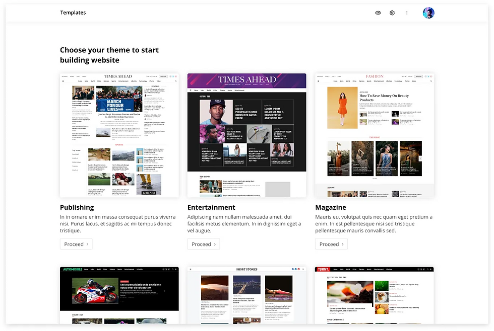
Ahead work flow
The role of Ahead was to help publishers to design and create their website through simple steps. Page Builder helps publishers to get components from Ahead and build a website based on their requirements.
The role of Page Builder mainly focused on two things
Build a set of pages like Home, Story, Landing, Search, Section, Author, etc. based on publisher's business requirements.
Make a unique brand for each publisher.
Ahead Layout
The objective was to give a smooth page building experience for our users. We were not expecting professional designers to design a page, but anyone with basic design knowledge.
Page builder should help publishers in
Effortless building of screens
Building a Scalable Design
Give an Intuitive and consistent behaviour across pages

We broke down every page into rows and slots for the ease of building, the concept on which Ahead is based on. Minimized the cognitive overload by not adding a lot of settings on the surface. This made interface looks very clean.
Building Landing page
The landing page is made by adding up rows. Each row can be a set of story collections, ads, or widgets. Clicking on the add button will show all the available rows for a publisher. Publishers can choose layouts from the set of options available. Once chosen it gets added up to the specific space.

Editing a Collection row
A collection is a set of stories. Based on the publishing vertical and story content, the requirements change for each collection row. We have a set of visual and functional settings for each row. It includes options to enable or disable collection title, Section tag, author name. And also options like setting up number of stories in each row, changing story card layouts.


Since settings are the most frequently used action it can be accessed in one click and all other actions from the meatball menu.

Branding in Ahead
One of the objectives of Ahead was to give a unique brand expression to all onboarding publishers. This was handled at different levels in the page builder.
Branding at Global level
The atomic components like typography, colour palette, and visual elements, etc come under global settings. They will not vary on each page or in each collection row.

Font: Each publisher can add up to two fonts. Performance was never compromised. This forced us to limit the font options to two.
Color palette: We gave the option to add their brand colors to the website. They can reuse these colours in multiple occasions.
Visual elements: Visual elements included Collection titles, Section tags, button style. With all these combinations of fonts, colour palette, and visual elements publishers can easily build a wide variety of unique websites.
Story Page
A story page is the most important page for the publisher. More than 70% of their audience landed here for most of our clients. We made sure that our story templates will cover up all the business requirements for them.
Bold supports different story types like text story, live blog, listicle, video story, podcast, etc. For each story type, we have a set of possible templates in Page Builder. These story templates are made in Ahead based on different scenarios.
Different templates include -
Hero Priority: A layout that puts strong emphasis on the hero image. The hero image appears first, either full-bleed or in a 16:9 ratio..
Headline Priority: A layout where the headline comes first. Ideal for showcasing an ad or a related story collection in the first deck on desktop. Can also be used when the hero image is a lower priority.
Hero Vertical: A layout designed for vertical hero images. Optimized for mobile to provide a full-image view, with a side-by-side presentation on desktop.
Headline Overlay: A layout where the headline is placed directly over the hero image.
Choosing template for a story type.
Clicking on the change layout button will show the set of templates available for a story type. A publisher can choose one template from those options.

Paper
For choosing designs for different templates in page builder we introduced paper. A paper is a full-screen popup from which a template/component is chosen.

Story page options within a template
We also give controls for publishers to change layout based on different factors like hero image ratio, the relevance of author details & section tags, business requirements like showing ads, related stories, etc. They can choose where the ads should come up. Where to place related stories or other story collections.

Branding in Story Page
Story Page elements act as key moments to express the brand on the story page. A Publisher can choose designs from the set of templates available in Page builder. Also, each template has further settings like choosing a colour from the palette, changing the font style, etc.

Other Pages
Page builder deals with pages like Author, Tag page, Search Page, Static pages. Page builder provides templates for each page based on its content requirements. Each template will have options to meet their business and audience requirements. A publisher can navigate to different pages from the header.

An initial stage prototype of Pagebuilder showcasing different features.
What We Accomplished
With Ahead, we’ve transformed the how our users design, customize, and manage their websites. What once required specialized design teams and extensive development time can now be accomplished quickly and intuitively, all while maintaining brand uniqueness and scalability. By combining the flexibility of Ahead and the power of Bold’s headless CMS, publishers can craft experiences that reflect their identity and engage their audience.
Current update: In the years that followed, Page Builder’s popularity grew significantly, with many publishers adopting the platform. In several cases, publishers have even switched from their custom interfaces to Page Builder, drawn by its flexibility and rich feature set. Today, it supports over 100 publishers, including prominent brands such as The New Indian Express, Bar & Bench, and Outlook Traveller.
My Role
I've been heading the designs for Page Builder from the very beginning. I have closely worked with the product manager and other stakeholders to convert our vision to the final designs. The process took a span of 6 months from conducting user research to designing final visuals.
Comments