Building Ambo
- Feb 25
- 7 min read
Updated: 2 days ago

Overview
Ambo is an early-stage employee advocacy platform that empowers employees to become brand advocates, enabling companies to share and amplify content through their employees’ personal networks.
When I joined the team, the product was transitioning from a simple post-sharing tool into a more flexible content distribution system. The challenge wasn’t just improving UI, it was redefining how content workflows should scale as teams, accounts, and distribution complexity grew. This wasn’t a redesign. It was a structural evolution.
The Challenge of Scaling
As Ambo matured, we added powerful capabilities like AI-assisted writing, complex scheduling, and deeper insights. However, this expansion also introduced new complexity. Workflows became fragmented across different surfaces, and key actions began competing for attention, resulting in a dense interface that was harder for admins to navigate. To support Ambo's next phase of growth, we needed to evolve from a collection of individual features into a cohesive, system-level workflow that seamlessly connects content from ideation, to distribution, to measurable impact.
This structural evolution focused on maturing four key areas:
Content creation workflow – Scaling the UI to support multi-variant posts/reposts without cognitive overload.
Content dashboard – Helping teams manage and track content more efficiently
Analytics – Weaving metrics into a clear narrative connected directly to reach and participation.
Inspiration hub – Expanding the user journey upstream to solve for content discovery and ideation.
Below are some highlights from the redesigned interface.


Restructuring Content Creation
Admin content creation workflow
The admin workflow in Ambo focuses on preparing content for distribution. Admins create posts, configure how they should be shared, and select the advocates who will distribute them across their networks. The platform then helps coordinate how that content is published over time.
Where Complexity Started to Appear
As the product evolved, new capabilities were introduced to support more flexible content distribution.
A single post could now:
Support multiple variations tailored for different contexts
Each Variation can have reposts reposts
Allow each variation and reposts to be shared by multiple advocates
Include variation-level settings such as scheduling time and advocate selection, in addition to general post settings
While these features increased flexibility, they also introduced new complexity to the creation workflow.

The Challenge
Integrating these capabilities into the existing interface proved difficult.
The content creation screen already contained several functional areas:
Post Settings
Post editing
Variations management
Reposts management
Distribution settings
Post preview
Bringing all of these together within a single surface risked making the interface visually dense and cognitively overwhelming. The challenge was to design a workflow that could support this increased flexibility while still feeling clear, structured, and easy to navigate for users.
Editorial Experience Redesign
From Form-Based to Post-Centric
The Challenge: The legacy design utilized a rigid, multi-field form that fragmented the content creation process and increased cognitive load.
The Solution: We transitioned to a streamlined, WYSIWYG view that mirrors the published state, empowering advocates to draft with context and confidence.

Key UX Enhancements:
Contextual Priority: Replaced abstract data-entry fields with a near-final post preview. By shifting the mental model to focus directly on the output, we stripped away administrative distraction.
Streamlined Media Curation: Swapped the bulky upload "drop zone" for a sleek, inline gallery. This provides immediate visual feedback and dramatically tightens the visual hierarchy.
Modular Engagement Loops: Reimagined secondary actions (like "first comment" and "auto-repost") from hidden toggles into contextual, sequential steps integrated naturally at the bottom of the drafting workflow.
The Impact: A frictionless creation experience that reduces user hesitation, accelerates drafting time, and drives higher-quality, authentic advocate shares.
Exploration different workflows
I explored several possible directions to bring in all the new features and narrowed them down to three strong options.
Each concept was prototyped in Figma and stress-tested against typical user flows to evaluate clarity, scalability, and usability.
Workflow A
Variations as a First-Class Sidebar followed by edit post and separate preview.

✅ Strengths
Fast switching between variations
Faster work flow
Scales well as more metadata/features are added
⚠️ Weakness
Hierarchy between global settings and variations is less obvious
Does not scale well when settings increase
3-column layout can feel intimidating
Source URL sits close to variation editor
Workflow B
Variations Inside Post Settings and preview and edit post as switchable units.

✅ Strengths
Very clear hierarchy (settings → variations)
Easier for new users to understand
⚠️ Weakness
Does not scale well when settings/variations variations increase
Hard to scan
Workflow C
Variations Inside Post Settings and preview and edit post as switchable units.

✅ Strengths
Clean separation between global and variaiton settings
Familiar interaction pattern
⚠️ Weakness
Users must remember context
No simultaneous visibility
Solution
Compared the 3 models with Scalability, speed and confidence

While the earlier approaches solved parts of the problem, Workflow C provided the strongest foundation for the product long term, balancing efficiency with a structure that could scale with future features. This became the basis for the new creation workflow.
As we tested different workflow directions, we noticed that admins relied heavily on AI to write and refine posts. However, creating new versions of a post still required manual steps after generating variations.
To address this, we experimented with a workflow where AI rewrite results could be directly converted into new variations. Instead of copying and editing content manually, admins could select AI-generated options and instantly turn them into ready-to-use variations.
This significantly reduced the effort required to prepare multiple versions of a post and made the content creation process much faster. Over time, this workflow has become one of the most frequently used features in the product.
From Status Dashboard to Performance Workspace
As Ambo matured, the dashboard needed to do more than show system status. It needed to help teams understand how their content was performing and where to focus next.
The original dashboard surfaced metrics like shares, impressions, and clicks, but these numbers lived separately from the content itself. Users could see activity, but it wasn’t easy to connect performance back to the posts that generated it.
This created a gap between insight and action.
Reframing the role of the dashboard
Instead of treating the dashboard as a static overview, we reframed it as a performance workspace, a place where teams could quickly understand what’s happening and decide what to do next. Three changes shaped the redesign.
Surface insights first: We introduced a Weekly Insights layer at the top of the dashboard, highlighting key engagement metrics with trend indicators. This gives teams an immediate sense of momentum without requiring them to open analytics.

Bring performance closer to content: Engagement signals like shares, clicks, and impressions now appear directly on each content card. This makes it easy to see which posts are driving impact while browsing the content feed.

Improve scanning and control: Clearer content states and filtering options make it easier to navigate large content libraries and quickly focus on what matters.

A clearer performance story
The redesigned dashboard shifts Ambo from a content management interface to a decision-making surface.

Calendar View
Introducing a calendar view transformed content management from a static list into a visual planning system. It gave teams instant visibility into publishing cadence, helped prevent scheduling conflicts, and made campaign planning across channels faster and more collaborative.

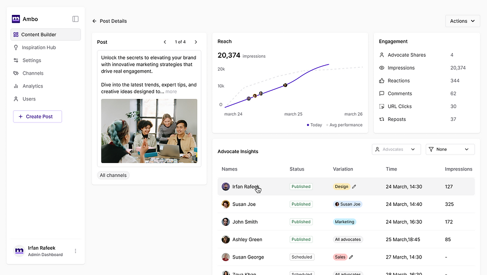
Post Details
Introducing a dedicated post detail page gave admins a single place to monitor content performance after publishing. It combined reach, engagement, and advocate activity in one view, making it easier to track impact, compare variations, identify top contributors, and take faster actions without switching between multiple pages.
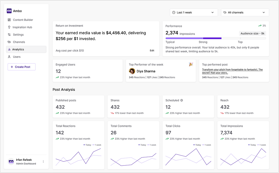
Redesigning Ambo Analytics
What wasn’t working
The original analytics dashboard surfaced a large set of metrics but lacked a clear hierarchy. Important signals such as ROI, top advocates, and post performance were buried in dense tables, making it difficult for teams to quickly understand how their advocacy program was performing.

Shifting the focus
Rather than simply displaying data, the redesign focused on helping teams quickly interpret performance. The experience was reorganized around the questions users naturally ask:
Is our advocacy program performing well?
Which posts are driving engagement?
Who are our most impactful advocates?
A clearer performance story
The new dashboard introduces a stronger visual hierarchy with three key sections:
Program performance highlighting ROI and overall reach
Post analysis to surface high-performing content
Advocate insights to identify the employees driving impact
Trend indicators, comparison graphs, and highlighted performers make performance easier to scan and interpret.
The result
The redesign transforms analytics from a collection of metrics into a clear performance narrative, helping teams quickly understand what’s working and where to focus next.
Introducing Inspiration Hub
Through customer interviews and product feedback, a recurring pattern emerged. Admins didn’t struggle with publishing, they struggled with finding the next thing worth sharing.
Teams often had plenty of valuable content scattered across blogs, company updates, and industry articles. But discovering these pieces and turning them into employee-ready posts required manual searching, copying, and rewriting. The friction meant good content frequently went unused.
This insight led us to the idea of Inspiration Hub, a dedicated space designed to help admins discover ideas and quickly turn them into posts.

The hub aggregates multiple sources of inspiration in one place: RSS feeds, company posts, and trending LinkedIn content. Instead of jumping between platforms, admins can browse relevant content and convert it into a post with a single action.
Each item acts as a starting point for creation. With options like Create Post or Share Post, admins can instantly transform inspiration into structured content within the publishing workflow.

By turning inspiration into a designed step in the workflow, the hub reduces the gap between discovering an idea and publishing a post making content creation faster and far more consistent for advocacy teams.
The Impact: Evolving for Scale and Driving Engagement
Maturing Ambo from a basic tool into a connected platform was a natural step to meet our users' growing needs. By linking content discovery, creation, and performance tracking, we evolved the platform from a simple publishing utility into a complete system that actively drives employee sharing.
Measuring the Evolution
The structural updates across the platform did more than improve usability. They drove measurable shifts in how admins used Ambo to grow their programs.
Faster Content Creation: By simplifying the editing experience and adding AI writing directly into the drafting process, the average time to publish decreased by 40%.
Higher Adoption of Advanced Features: With a clearer layout separating global settings from post variations, the creation of posts with multiple versions increased by over 35%. This proved that users will use advanced features when the setup is easy to understand.
Key Takeaways
Guide the user instead of just adding features: As capabilities expanded, we focused on guiding the user's attention. We scaled advanced features without making the screen confusing or overwhelming.
Make data actionable: By placing engagement numbers directly on the content workflow, we turned static charts into active workspaces. This closed the gap between seeing data and taking action.
Solve the whole journey: Expanding our focus to the beginning of the process proved that removing barriers often means helping users find ideas, rather than just helping them publish.
Looking Ahead
This evolution establishes a strong foundation for Ambo's next chapter. By thinking in complete systems rather than individual screens, the platform is now ready to handle future updates easily. This empowers admins to spend less time managing software and more time sharing great stories.
Comments