Redesigning subscription onboarding flow for digital publishers — reducing drop-off by removing friction at the critical moments before checkout.
Subscription
A digital subscription provides access to content on your website. Each subscription offers a different level of access which can be duration based, or content-specific.
Problems with our current Subscription flow
The subscription action started from the subscription listing page. The steps included in purchasing a subscription were
- Choose the subscription from the given list
- Do payment via any of the payment gateways available
This model was purely based on the concept of optimizing the number of steps for subscription purchases.
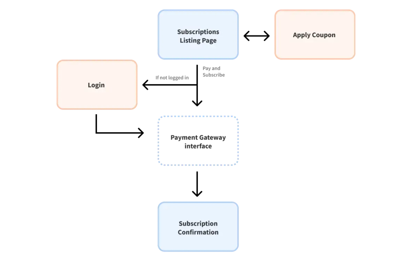
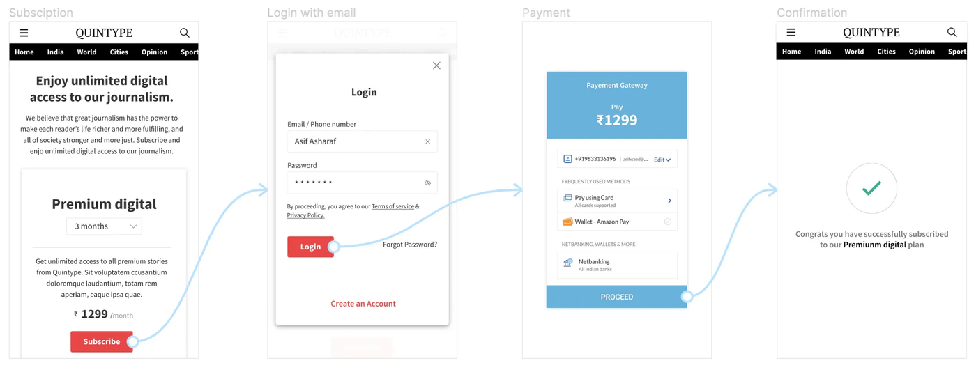
Even though the number of steps was less, we observed a large number of user drop-offs between the login and payment screens. On further research, we identified the following problems;
- Users lost context upon logging in: There was no plan confirmation screen, and users often lost track of which plan they had chosen, during the purchase journey itself. This was particularly in the case of users who revisited the screens after a break.
- Users sometimes questioned the reason for login. Log in was seen as an unnecessary prompt before subscription.
- Users dropped out due to login/signup failures before they could reach the subscription payment screen.
Steps taken
Research: We studied different publisher websites, and observed metrics related to subscription flows. Being transparent with the user stood out as a best practice. All effective working models intimated users beforehand about the steps to be followed to buy a subscription.
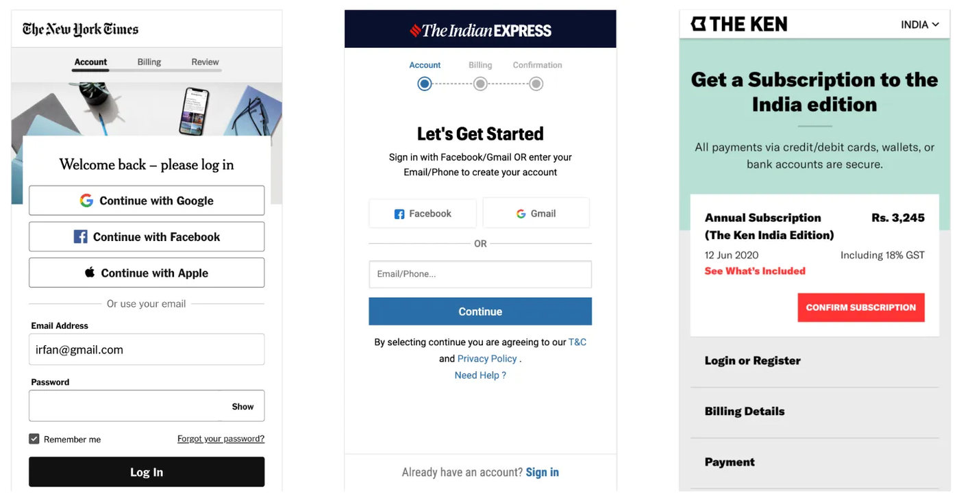
On the basis of these findings, I created a wireflow and prototype.
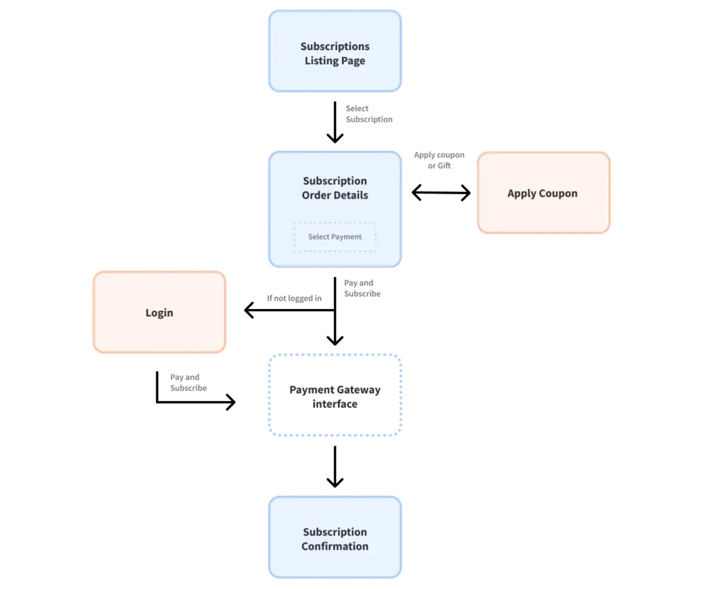
Testing the prototype
Upon testing the above prototype with various personas, it yielded better results than our current model.
However, the login functionality was still a barrier for those who wanted to get started with subscriptions. Some users questioned the credibility of the login module and were not comfortable providing login details/credentials. Others dropped off due to failures like wrong OTP.
Login served as an impediment to the subscription flow, with but one benefit - gathering verified log in credentials helped us easily reach out to customers, subsequently. Was this worth the number of drop offs that the module was guaranteeing? We think NO.
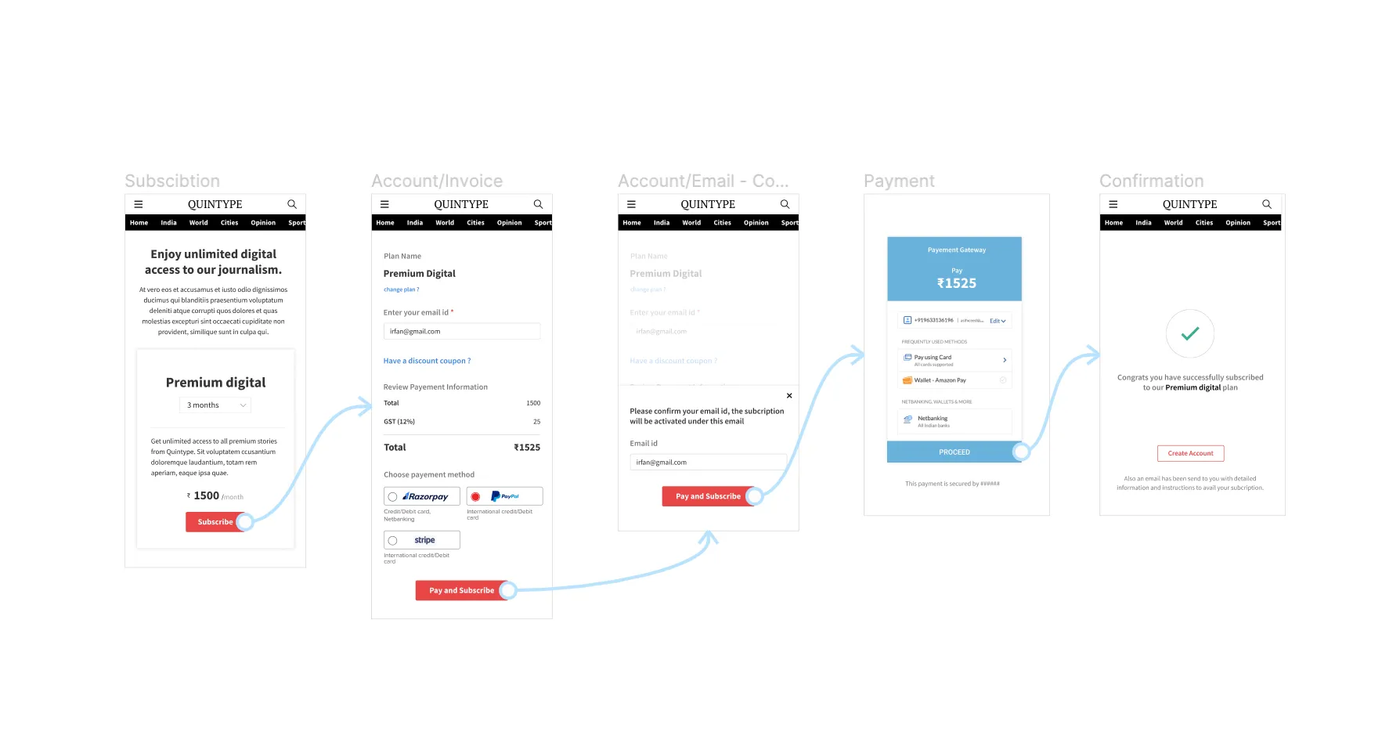
After numerous design explorations, we came up with the below design flow where the login/signup module came after subscription.
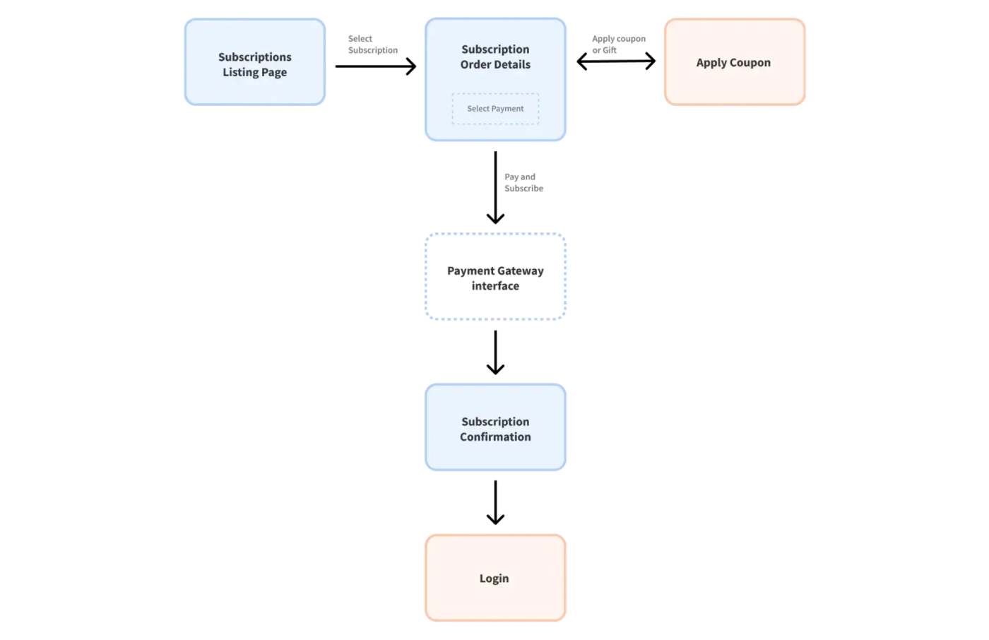
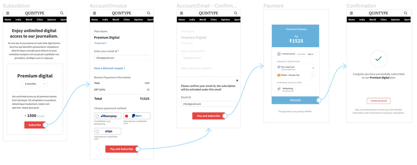
With this design, our goal was to make the user to customer conversion as instant as possible. Once the decision of purchase is made by the user, we tried to avoid any roadblocks that may lead to a second thought. We took the Login/Signup after the checkout process. This helps us to reduce the steps/time for the subscription purchase and convert the user to the customer at the first moment of truth.
The prototype flow without login, by just getting the email id from user
The only possibility for the user to drop off from this subscription flow would be to enter the wrong email id. We are hence confirming the email ID once more in this flow. Upon successful payment, an email is sent to the provided ID. Users can either use the hyperlink specified in the email to sign-up directly or they can signup/login with the given email ID to avail the subscription.
Now we conducted usability tests on this prototype and received positive feedback from users. It outperformed the earlier two versions, offering a flow that is simple, functional, and easy to understand.
The outcome
We tested the final flow with 7 users, and the results were clear. Most participants were able to complete the journey without assistance, understood why their email was required, and preferred creating an account after completing their purchase.
The final flow improved subscription completion by ~32% over the original experience and reduced drop-offs by ~14% compared with the login-first prototype.
More importantly, the exercise reinforced a simple principle: optimising a journey isn't always about reducing the number of steps. It's about removing friction at the moments that matter most. By moving authentication out of the critical purchase path, we were able to protect user momentum without giving up the business need for account creation.